:host {
/* breakpoints: not-implemented / reference only */
/* --shadow-breakpoint-xs: 320px; */
/* --shadow-breakpoint-sm: 490px; */
/* --shadow-breakpoint-md: 768px; */
/* --shadow-breakpoint-lg: 1040px; */
/* --shadow-breakpoint-xl: 1440px; */
--shadow-thumbnail-position-start:
"media gift-dialog-header"
"media content"
"media gift-block-actions";
--shadow-thumbnail-position-end:
"gift-dialog-header media"
"content media"
"gift-block-actions media";
/* border radius */
--shadow-border-radius-xs: calc(var(--shadow-border-radius-scale, 65) / 100 * 1rem);
--shadow-border-radius-sm: calc(var(--shadow-border-radius-scale, 65) / 100 * 1.5rem);
--shadow-border-radius-base: calc(var(--shadow-border-radius-scale, 65) / 100 * 2.5rem);
--shadow-outline-width: calc(var(--shadow-field-border-width) + 0.5px);
/* buttons */
--shadow-hover-style-light: #ffffff;
--shadow-hover-style-dark: #000000;
--shadow-primary-button-surface--active: color-mix(in srgb, var(--shadow-primary-button-surface), var(--shadow-hover-style) 20%);
--shadow-primary-button-surface--hover: color-mix(in srgb, var(--shadow-primary-button-surface), var(--shadow-hover-style) 16%);
--shadow-primary-button-text-color--active: color-mix(in srgb, var(--shadow-primary-button-text-color), var(--shadow-hover-style) 20%);
--shadow-primary-button-text-color--hover: color-mix(in srgb, var(--shadow-primary-button-text-color), var(--shadow-hover-style) 16%);
--shadow-secondary-button-surface--active: color-mix(in srgb, var(--shadow-secondary-button-surface), var(--shadow-hover-style) 20%);
--shadow-secondary-button-surface--hover: color-mix(in srgb, var(--shadow-secondary-button-surface), var(--shadow-hover-style) 16%);
--shadow-secondary-button-text-color--active: color-mix(in srgb, var(--shadow-secondary-button-text-color), var(--shadow-hover-style) 20%);
--shadow-secondary-button-text-color--hover: color-mix(in srgb, var(--shadow-secondary-button-text-color), var(--shadow-hover-style) 16%);
/* do not change the root text size */
--shadow-font-size: 16px;
/* text and fonts */
--shadow-font-size-sm: clamp(12px, calc(14px * var(--shadow-font-scale)), 16px);
--shadow-font-size-base: clamp(12px, calc(16px * var(--shadow-font-scale)), 20px);
--shadow-font-size-lg: clamp(16px, calc(24px * var(--shadow-font-scale)), 28px);
--shadow-font-weight-md: 500;
--shadow-font-weight-lg: 600;
--shadow-line-height-base: 1.5em;
/* transitions */
--shadow-transition-duration: 0.1s;
--shadow-spinner-duration: 0.7s;
/* disabled */
--shadow-disabled-opacity-sm: 0.16;
--shadow-disabled-opacity: 0.32;
--shadow-disabled-opacity-md: 0.4;
--shadow-disabled-opacity-lg: 0.64;
/* precalculated percentages for color-mix */
--shadow-disabled-opacity-percent: 32%;
--shadow-disabled-opacity-sm-percent: 16%;
--shadow-disabled-opacity-md-percent: 40%;
--shadow-disabled-opacity-lg-percent: 64%;
--shadow-disabled-cursor: not-allowed;
/* form elements */
--shadow-form-element-surface--disabled: color-mix(in srgb, var(--shadow-form-element-surface) var(--shadow-disabled-opacity-percent), var(--shadow-secondary-text-color) 8%);
--shadow-form-element-border-color--active: color-mix(in srgb, var(--shadow-form-element-border-color), white 83%);
--shadow-form-element-border-color--disabled: color-mix(in srgb, var(--shadow-form-element-border-color) var(--shadow-disabled-opacity-percent), var(--shadow-secondary-text-color) 8%);
--shadow-form-element-text-color--disabled: color-mix(in srgb, var(--shadow-form-element-text-color), var(--shadow-secondary-text-color) 8%);
--shadow-form-element-placeholder-text-color: color-mix(in srgb, var(--shadow-form-element-text-color) var(--shadow-disabled-opacity-percent), transparent);
--shadow-form-element-placeholder-text-color--disabled: color-mix(in srgb, var(--shadow-form-element-text-color) var(--shadow-disabled-opacity-percent), var(--shadow-secondary-text-color) 8%);
--shadow-form-element-selection-color--active: color-mix(in srgb, var(--shadow-form-element-selection-color), var(--shadow-hover-style) 40%);
--shadow-form-element-selection-color--hover: color-mix(in srgb, var(--shadow-form-element-selection-color), var(--shadow-hover-style) 32%);
/* primary colors */
--shadow-primary-text-color--hover: color-mix(in srgb, var(--shadow-primary-text-color), var(--shadow-hover-style) 32%);
/* secondary colors */
--shadow-secondary-text-color--disabled: color-mix(in srgb, var(--shadow-secondary-text-color) var(--shadow-disabled-opacity-lg-percent), var(--shadow-secondary-text-color) 8%);
/* spacing */
--shadow-spacing-scale-base: 1;
--shadow-spacing-scale-less: 0.75;
--shadow-spacing-scale-more: 1.166;
--shadow-spacing-fixed: 4px;
--shadow-spacing-base: clamp(12px, calc(16px * var(--shadow-spacing-scale)), 24px);
--shadow-spacing-lg: clamp(16px, calc(24px * var(--shadow-spacing-scale)), 28px);
--shadow-spacing-sm: clamp(8px, calc(12px * var(--shadow-spacing-scale)), 14px);
--shadow-spacing-xs: clamp(6px, calc(8px * var(--shadow-spacing-scale)), 10px);
/* inline block */
--shadow-feature-max-height: 500px;
--shadow-textarea-min-height: 80px;
--shadow-block-margin-block-start: calc(1em * var(--shadow-spacing-scale));
--shadow-block-margin-block-end: calc(2em * var(--shadow-spacing-scale));
/* shadows */
--shadow-shadow-blur: 1.5rem;
--shadow-shadow-color: rgba(0, 0, 0, 0.25);
--shadow-shadow-offset: 0.75rem;
/* the default look: what a shop without a presets entry paints; a saved entry overrides these per option type below */
--shadow-font-family: inherit;
--shadow-header-font-family: inherit;
--shadow-font-weight-base: 400;
--shadow-letter-spacing: normal;
--shadow-button-text-transform: none;
--shadow-button-letter-spacing: normal;
--shadow-button-font-style: normal;
--shadow-launcher-button-font-weight: 400;
--shadow-launcher-button-max-width: 500px;
--shadow-launcher-button-alignment: center;
--shadow-launcher-button-content-justify-content: space-between;
--shadow-launcher-button-content-flex-direction: row-reverse;
--shadow-grid-template-areas: var(--shadow-thumbnail-position-start);
--shadow-border-radius-scale: 60;
--shadow-block-border-surface: #00000000;
--shadow-border-width: 1px;
--shadow-field-border-width: var(--shadow-border-width);
--shadow-hover-style: var(--shadow-hover-style-light, --shadow-hover-style-light);
--shadow-launcher-button-surface: #000000;
--shadow-launcher-button-text-color: #ffffff;
--shadow-launcher-button-border-surface: #00000000;
--shadow-primary-button-surface: #000000;
--shadow-primary-button-text-color: #ffffff;
--shadow-primary-button-border-surface: #00000000;
--shadow-primary-button-border-surface--active: transparent;
--shadow-primary-button-border-surface--hover: transparent;
--shadow-secondary-button-surface: #0000000f;
--shadow-secondary-button-text-color: #333333;
--shadow-secondary-button-border-surface: #00000000;
--shadow-secondary-button-border-surface--active: transparent;
--shadow-secondary-button-border-surface--hover: transparent;
--shadow-font-scale: calc(100 / 100);
--shadow-form-element-surface: #ffffff;
--shadow-form-element-border-color: #0000000f;
--shadow-form-element-text-color: #333333;
--shadow-form-element-selection-color: #000000;
--shadow-selection-accent-color: var(--shadow-form-element-selection-color);
--shadow-selection-checked-surface: var(--shadow-form-element-selection-color);
--shadow-selection-swatch-color: var(--shadow-form-element-selection-color);
--shadow-primary-surface: #ffffff;
--shadow-primary-text-color: #000000;
--shadow-secondary-surface: #f3f3f3;
--shadow-secondary-text-color: #333333;
--shadow-spacing-scale: var(--shadow-spacing-scale-base, 1);
--shadow-gift-thumbnail-size: 60px;
--shadow-thumbnail-size: clamp(40px, var(--shadow-gift-thumbnail-size), 200px);
--shadow-thumbnail-flex-direction: row;
--shadow-thumbnail-order: -1;
--shadow-thumbnail-margin-left: 0;
--shadow-thumbnail-margin-right: 0.6em;
--shadow-block-padding: var(--shadow-block-padding-block-start, var(--shadow-spacing-sm)) var(--shadow-block-padding-inline-end, var(--shadow-spacing-sm)) var(--shadow-block-padding-block-end, var(--shadow-spacing-sm)) var(--shadow-block-padding-inline-start, var(--shadow-spacing-sm));
/* default styles */
all: revert;
box-sizing: border-box;
cursor: default;
display: block;
font-family: var(--shadow-font-family);
font-size: var(--shadow-font-size);
line-height: var(--shadow-line-height-base);
letter-spacing: var(--shadow-letter-spacing);
margin-block-start: var(--shadow-block-margin-start, var(--shadow-spacing-xs)) !important;
margin-block-end: var(--shadow-block-margin-end, var(--shadow-spacing-xs)) !important;
margin-inline-start: var(--shadow-block-margin-inline-start, 0) !important;
margin-inline-end: var(--shadow-block-margin-inline-end, 0) !important;
text-align: start;
width: -webkit-fill-available;
white-space: normal;
}
:host([option-type="product"]) {
--shadow-font-family: inherit;
--shadow-header-font-family: inherit;
--shadow-font-weight-base: 400;
--shadow-letter-spacing: normal;
--shadow-button-text-transform: none;
--shadow-button-letter-spacing: normal;
--shadow-button-font-style: normal;
--shadow-launcher-button-font-weight: 400;
--shadow-launcher-button-max-width: 500px;
--shadow-launcher-button-alignment: center;
--shadow-launcher-button-content-justify-content: space-between;
--shadow-launcher-button-content-flex-direction: row-reverse;
--shadow-grid-template-areas: var(--shadow-thumbnail-position-start);
/* border radius */
--shadow-border-radius-scale: 60;
--shadow-block-border-surface: #00000000;
--shadow-border-width: 1px;
/* buttons */
--shadow-hover-style: var(--shadow-hover-style-light, --shadow-hover-style-light);
--shadow-launcher-button-surface: #FF4D00;
--shadow-launcher-button-text-color: #ffffff;
--shadow-launcher-button-border-surface: #00000000;
--shadow-primary-button-surface: #FF4D00;
--shadow-primary-button-text-color: #ffffff;
--shadow-primary-button-border-surface: #00000000;
--shadow-primary-button-border-surface--active: transparent;
--shadow-primary-button-border-surface--hover: transparent;
--shadow-secondary-button-surface: #0000000f;
--shadow-secondary-button-text-color: #333333;
--shadow-secondary-button-border-surface: #00000000;
--shadow-secondary-button-border-surface--active: transparent;
--shadow-secondary-button-border-surface--hover: transparent;
/* text and fonts */
--shadow-font-scale: calc(100 / 100);
/* form elements */
--shadow-form-element-surface: #ffffff;
--shadow-form-element-border-color: #0000000f;
--shadow-form-element-text-color: #333333;
--shadow-form-element-selection-color: #000000;
--shadow-selection-accent-color: var(--shadow-form-element-selection-color);
--shadow-selection-checked-surface: var(--shadow-form-element-selection-color);
--shadow-selection-swatch-color: var(--shadow-form-element-selection-color);
/* primary colors */
--shadow-primary-surface: #ffffff;
--shadow-primary-text-color: #000000;
/* secondary colors */
--shadow-secondary-surface: #f3f3f3;
--shadow-secondary-text-color: #333333;
/* spacing */
--shadow-spacing-scale: var(--shadow-spacing-scale-base, 1);
/* media */
--shadow-gift-thumbnail-size: 60px;
--shadow-thumbnail-size: clamp(40px, var(--shadow-gift-thumbnail-size), 200px);
--shadow-thumbnail-flex-direction: row;
--shadow-thumbnail-order: -1;
--shadow-thumbnail-margin-left: 0;
--shadow-thumbnail-margin-right: 0.6em;
}
:host([option-type="order"]) {
--shadow-font-family: inherit;
--shadow-header-font-family: inherit;
--shadow-font-weight-base: 400;
--shadow-letter-spacing: normal;
--shadow-button-text-transform: none;
--shadow-button-letter-spacing: normal;
--shadow-button-font-style: normal;
--shadow-launcher-button-font-weight: 400;
--shadow-launcher-button-max-width: 500px;
--shadow-launcher-button-alignment: center;
--shadow-launcher-button-content-justify-content: space-between;
--shadow-launcher-button-content-flex-direction: row-reverse;
--shadow-grid-template-areas: var(--shadow-thumbnail-position-start);
/* border radius */
--shadow-border-radius-scale: 60;
--shadow-block-border-surface: #00000000;
--shadow-border-width: 1px;
/* buttons */
--shadow-hover-style: var(--shadow-hover-style-light, --shadow-hover-style-light);
--shadow-launcher-button-surface: #FF4D00;
--shadow-launcher-button-text-color: #ffffff;
--shadow-launcher-button-border-surface: #00000000;
--shadow-primary-button-surface: #FF4D00;
--shadow-primary-button-text-color: #ffffff;
--shadow-primary-button-border-surface: #00000000;
--shadow-primary-button-border-surface--active: transparent;
--shadow-primary-button-border-surface--hover: transparent;
--shadow-secondary-button-surface: #0000000f;
--shadow-secondary-button-text-color: #333333;
--shadow-secondary-button-border-surface: #00000000;
--shadow-secondary-button-border-surface--active: transparent;
--shadow-secondary-button-border-surface--hover: transparent;
/* text and fonts */
--shadow-font-scale: calc(100 / 100);
/* form elements */
--shadow-form-element-surface: #ffffff;
--shadow-form-element-border-color: #0000000f;
--shadow-form-element-text-color: #333333;
--shadow-form-element-selection-color: #000000;
--shadow-selection-accent-color: var(--shadow-form-element-selection-color);
--shadow-selection-checked-surface: var(--shadow-form-element-selection-color);
--shadow-selection-swatch-color: var(--shadow-form-element-selection-color);
/* primary colors */
--shadow-primary-surface: #ffffff;
--shadow-primary-text-color: #000000;
/* secondary colors */
--shadow-secondary-surface: #f3f3f3;
--shadow-secondary-text-color: #333333;
/* spacing */
--shadow-spacing-scale: var(--shadow-spacing-scale-base, 1);
/* media */
--shadow-gift-thumbnail-size: 60px;
--shadow-thumbnail-size: clamp(40px, var(--shadow-gift-thumbnail-size), 200px);
--shadow-thumbnail-flex-direction: row;
--shadow-thumbnail-order: -1;
--shadow-thumbnail-margin-left: 0;
--shadow-thumbnail-margin-right: 0.6em;
}
*,
*::before,
*::after {
box-sizing: border-box;
}
.gift-block__launcher .icon-wrapper svg,
:host(wrapped-extension) gift-block-launcher [part="container"] label svg,
:host(wrapped-extension) [feature="gift-option"] [part="container"] label svg,
:host(wrapped-gift-block) gift-block-option-heading label svg {
box-sizing: border-box;
border: calc(var(--shadow-field-border-width) + 0.5px) solid;
border-radius: max(0px, calc(min(0.20625em, var(--shadow-border-radius-sm)) + min(var(--shadow-border-radius-sm) * 1000, var(--shadow-field-border-width) - 1px)));
height: calc(var(--shadow-font-size-base) * 0.7875 + 3.5 * var(--shadow-field-border-width) - 0.5px);
overflow: visible;
width: calc(var(--shadow-font-size-base) * 0.7875 + 3.5 * var(--shadow-field-border-width) - 0.5px);
}
.gift-block__launcher .icon-wrapper svg,
:host(wrapped-extension) gift-block-launcher [part="container"] label svg {
height: calc(var(--shadow-block-launcher-font-size, var(--shadow-launcher-font-size, var(--shadow-font-size-base))) * 0.7875 + 3.5 * var(--shadow-field-border-width) - 0.5px);
width: calc(var(--shadow-block-launcher-font-size, var(--shadow-launcher-font-size, var(--shadow-font-size-base))) * 0.7875 + 3.5 * var(--shadow-field-border-width) - 0.5px);
}
.checkmark-icon {
fill: none;
stroke-linecap: var(--shadow-tick-cap, round);
stroke-linejoin: var(--shadow-tick-join, round);
stroke-width: 1.5px;
}
gift-block-launcher:not([variant="inline"]) {
display: flex;
flex-direction: column;
gap: var(--shadow-spacing-xs);
align-items: var(--shadow-launcher-button-alignment);
& gift-block-visibility-notice {
display: block;
font-family: var(--shadow-font-family);
font-size: smaller;
font-weight: var(--shadow-font-weight-base);
font-style: var(--shadow-button-font-style);
letter-spacing: var(--shadow-button-letter-spacing);
padding: 0 var(--shadow-block-padding-inline-end, var(--shadow-spacing-sm)) 0 var(--shadow-block-padding-inline-start, var(--shadow-spacing-sm));
text-transform: var(--shadow-button-text-transform);
width: 100%;
}
}
.gift-block__launcher {
background-color: var(--shadow-launcher-button-surface);
border-color: var(--shadow-launcher-button-border-surface);
border-width: var(--shadow-launcher-button-border-width, var(--shadow-border-width));
border-radius: var(--shadow-launcher-button-border-radius, var(--shadow-border-radius-sm));
border-style: solid;
color: var(--shadow-launcher-button-text-color);
padding: var(--shadow-block-padding);
font-family: var(--shadow-font-family);
font-size: var(--shadow-block-launcher-font-size, var(--shadow-launcher-font-size, var(--shadow-font-size-base)));
font-weight: var(--shadow-launcher-button-font-weight);
font-style: var(--shadow-button-font-style);
letter-spacing: var(--shadow-button-letter-spacing);
max-width: var(--shadow-block-launcher-button-max-width, var(--shadow-launcher-button-max-width));
text-transform: var(--shadow-button-text-transform);
width: 100%;
&:hover {
cursor: pointer;
background-color: var(--shadow-primary-button-surface--hover);
border-color: var(--shadow-primary-button-border-surface--hover);
}
&:active {
background-color: var(--shadow-primary-button-surface--active);
border-color: var(--shadow-primary-button-border-surface--active);
}
&:focus,
&:focus-visible {
outline: none;
}
&[with-checkmark] {
position: relative;
display: inline-flex;
align-items: center;
gap: var(--shadow-spacing-fixed);
& .icon-wrapper {
display: flex;
flex-shrink: 0;
}
&[with-gift-options] {
.checkmark-icon {
display: block;
/* animation: unblur calc(var(--shadow-transition-duration) * 3) ease forwards; */
}
}
}
&[variant="link"] {
background: none;
border: none;
color: var(--shadow-primary-text-color);
font-size: var(--shadow-block-launcher-font-size, var(--shadow-launcher-font-size, var(--shadow-font-size-base)));
font-weight: var(--shadow-font-weight-base);
font-style: var(--shadow-button-font-style);
letter-spacing: var(--shadow-button-letter-spacing);
text-transform: var(--shadow-button-text-transform);
text-decoration: none;
margin-inline-start: -0.25rem;
padding: var(--shadow-block-padding-block-start, 0) var(--shadow-block-padding-inline-end, 0) var(--shadow-block-padding-block-end, 0) var(--shadow-block-padding-inline-start, 0);
width: auto;
&:hover {
cursor: pointer;
color: var(--shadow-primary-text-color--hover);
text-decoration: underline;
}
&[with-checkmark] {
padding-left: 0;
text-align: start;
word-break: keep-all;
}
& .button-content {
flex-direction: row;
justify-content: flex-start;
}
}
& .button-content {
display: inline-flex;
align-items: center;
gap: var(--shadow-spacing-fixed);
flex-direction: var(--shadow-launcher-button-content-flex-direction);
justify-content: var(--shadow-launcher-button-content-justify-content);
width: 100%;
& .label {
text-align: start;
}
}
& .icon-wrapper {
display: none;
align-items: center;
justify-content: center;
min-height: 1.5em;
min-width: 1.5em;
svg {
border-color: currentColor;
}
.checkmark-icon {
display: none;
stroke: currentColor;
}
}
}
.gift-block__launcher:disabled,
.gift-block__launcher[usage-limit-reached],
.gift-block__launcher[region-unavailable] {
cursor: var(--shadow-disabled-cursor);
opacity: var(--shadow-disabled-opacity);
pointer-events: none;
&[with-checkmark] {
.icon-wrapper {
opacity: var(--shadow-disabled-opacity-md);
}
}
}
/* gift block modal */
.gift-block-modal {
background-color: var(--shadow-primary-surface);
border: none;
border-radius: var(--shadow-border-radius-base);
box-shadow: 0 var(--shadow-shadow-offset) var(--shadow-shadow-blur) var(--shadow-shadow-color);
outline: var(--shadow-border-width) solid var(--shadow-block-border-surface);
padding: 0;
}
.gift-block-modal::backdrop {
background-color: rgba(156, 163, 175, 0.75);
}
.gift-block-modal:focus,
.gift-block-modal:focus-visible {
outline: var(--shadow-border-width) solid var(--shadow-block-border-surface);
}
@media (max-width: 768px) {
.gift-block-modal {
max-height: calc(100% - var(--shadow-spacing-sm));
max-width: calc(100% - var(--shadow-spacing-sm));
overscroll-behavior: contain;
}
}
/* gift block modal layout */
.gift-block-modal-layout {
display: grid;
grid-template-areas: var(--shadow-grid-template-areas);
grid-template-columns: 1fr 1fr;
grid-template-rows: auto 1fr auto;
max-height: 80dvh;
max-width: 80dvw;
overflow: hidden;
}
/* Collapse to 1-column layout if media is hidden */
.gift-block-modal-layout:has(section#media[hidden]),
.gift-block-modal-layout:has(section#media.with-media-inline),
.gift-block-modal-layout:not(:has(section#media)),
.gift-block-modal-layout:not(:has(section#media img)) {
grid-template-areas:
"gift-dialog-header"
"content"
"gift-block-actions";
grid-template-columns: 1fr;
grid-template-rows: auto 1fr auto;
section#media {
display: none;
}
}
gift-dialog-header {
align-items: flex-start;
background-color: var(--shadow-primary-surface);
display: flex;
flex-direction: row;
gap: var(--shadow-spacing-fixed);
grid-area: gift-dialog-header;
justify-content: space-between;
padding: var(--shadow-spacing-lg);
position: sticky;
top: 0;
z-index: 1;
& h1 {
color: var(--shadow-primary-text-color);
font-family: var(--shadow-header-font-family);
font-size: var(--shadow-font-size-lg);
font-weight: var(--shadow-font-weight-md);
line-height: 1.25em;
margin: 0;
}
/* dismiss button styles */
& button {
background-color: color-mix(in srgb, var(--shadow-secondary-text-color) 8%, transparent);
color: var(--shadow-secondary-text-color);
border-radius: var(--shadow-border-radius-xs);
font-size: var(--shadow-font-size-sm);
font-weight: var(--shadow-font-weight-lg);
font-style: var(--shadow-button-font-style);
letter-spacing: var(--shadow-button-letter-spacing);
text-transform: var(--shadow-button-text-transform);
width: 2.25em;
height: 2.25em;
min-width: 2.25em;
min-height: 2.25em;
outline: none;
border: 0;
cursor: pointer;
transition: background-color var(--shadow-transition-duration) ease,
color var(--shadow-transition-duration) ease;
&:hover {
background-color: color-mix(in srgb, var(--shadow-secondary-text-color) 6%, var(--shadow-hover-style) 12%);
}
&:active {
background-color: color-mix(in srgb, var(--shadow-secondary-text-color) 16%, var(--shadow-hover-style) 16%);
}
&:disabled {
pointer-events: none;
opacity: var(--shadow-disabled-opacity);
}
}
}
.gift-block-modal-layout gift-block-actions {
background-color: var(--shadow-primary-surface);
bottom: 0;
grid-area: gift-block-actions;
overscroll-behavior: contain;
position: sticky;
z-index: 1;
/* the buttons live in the component's own shadow; only its layout knobs are ours */
--shadow-actions-gap: var(--shadow-spacing-sm);
--shadow-actions-padding: var(--shadow-spacing-lg);
}
gift-dialog-content {
display: contents;
}
section#media {
align-self: stretch;
background-color: var(--shadow-secondary-surface);
grid-area: media;
grid-row: 1 / 4;
height: 100%;
padding: var(--shadow-spacing-lg);
position: sticky;
top: 0;
transition: order var(--shadow-transition-duration) ease,
width var(--shadow-transition-duration) ease;
&.with-media-cover {
& img {
height: 100%;
}
}
&.with-media-fill {
padding: 0;
& img {
border-radius: 0;
height: 100%;
}
}
& shopify-media {
& img {
border-radius: var(--shadow-border-radius-sm);
width: 100%;
height: auto;
}
}
}
section#content {
grid-area: content;
background-color: var(--shadow-primary-surface);
overflow-y: auto;
overscroll-behavior: contain;
scrollbar-width: thin;
-webkit-overflow-scrolling: touch;
padding: var(--shadow-spacing-lg);
padding-bottom: 0;
padding-top: 0;
position: relative; /* important to prevent content shifting when changing variants */
align-items: stretch;
display: flex;
flex-direction: column;
justify-content: flex-start;
gap: var(--shadow-spacing-lg);
transition: order var(--shadow-transition-duration) ease;
@media (max-width: 768px) {
& > *:first-child:not(:only-child) {
margin-top: unset;
}
}
& gift-block-option-heading {
display: block;
& span[part="label"] {
color: var(--shadow-primary-text-color);
display: block;
font-size: var(--shadow-font-size-base);
font-weight: var(--shadow-font-weight-md, 500);
line-height: 1.25em;
}
}
& .gift-option-group {
display: flex;
flex-direction: column;
gap: var(--shadow-spacing-lg);
}
/* gift product details */
& .gift-product {
display: flex;
flex-direction: column;
gap: var(--shadow-spacing-base);
}
& .gift-product-header {
align-items: center;
display: flex;
flex-direction: var(--shadow-thumbnail-flex-direction);
flex-wrap: wrap;
row-gap: var(--shadow-spacing-base);
column-gap: var(--shadow-spacing-sm);
}
& .gift-product-content {
display: flex;
flex: 1 1 50%;
flex-direction: column;
gap: var(--shadow-spacing-xs);
}
& .gift-product-media {
display: flex;
align-items: center;
&:has(shopify-media) {
--shadow-inline-media-max-size: var(--shadow-gift-thumbnail-size);
--shadow-inline-media-size: clamp(40px, var(--shadow-gift-thumbnail-size), var(--shadow-inline-media-max-size));
border-radius: var(--shadow-border-radius-sm);
height: var(--shadow-inline-media-size);
width: var(--shadow-inline-media-size);
overflow: hidden;
margin-inline-start: auto;
margin-inline-end: auto;
}
& shopify-media {
& img {
border-radius: var(--shadow-border-radius-sm);
width: 100%;
height: auto;
}
}
}
& .gift-product-title {
color: var(--shadow-primary-text-color);
display: var(--shadow-gift-product-title-display, block);
font-size: var(--shadow-font-size-base);
font-weight: var(--shadow-font-weight-md);
margin: 0;
}
& .gift-product-pricing {
display: flex;
gap: var(--shadow-spacing-xs);
margin: 0;
font-weight: var(--shadow-font-weight-base);
font-size: clamp(12px, calc(var(--shadow-font-size-base) * 0.94), 18px);
line-height: 1em;
}
& .gift-product-price {
color: var(--shadow-secondary-text-color);
}
& .gift-product-price--compare {
color: var(--shadow-secondary-text-color);
text-decoration: line-through;
opacity: var(--shadow-disabled-opacity);
}
& .gift-product-description {
font-weight: var(--shadow-font-weight-base);
color: var(--shadow-secondary-text-color);
font-size: clamp(12px, calc(var(--shadow-font-size-base) * 0.94), 18px);
line-height: 1.5em;
& shopify-data {
& :first-child {
margin-top: 0;
}
& :last-child {
margin-bottom: 0;
}
& ul {
padding-left: var(--shadow-spacing-lg);
}
}
}
}
:host(wrapped-gift-block) gift-block-option-heading label {
align-items: center;
cursor: pointer;
display: flex;
gap: var(--shadow-spacing-sm);
}
:host(wrapped-gift-block[gift-option-optional]) section#content .gift-option-group {
border-radius: var(--shadow-border-radius-sm);
position: relative;
}
:host(wrapped-gift-block[gift-option-optional]:not([gift-option-included])) section#content .gift-option-group {
pointer-events: none;
}
:host(wrapped-gift-block[gift-option-optional]:not([gift-option-included])) section#content .gift-option-group::after {
background-color: color-mix(in srgb, var(--shadow-primary-surface) 62%, transparent);
border-radius: inherit;
content: '';
inset: calc(var(--shadow-spacing-sm) * -1);
position: absolute;
}
/* shopify variant selector */
:host(wrapped-extension) gift-variant-selector {
--shadow-picker-padding: var(--shadow-block-padding-block-start, var(--shadow-spacing-sm)) var(--shadow-block-padding-inline-end, var(--shadow-spacing-base)) var(--shadow-block-padding-block-end, var(--shadow-spacing-sm)) var(--shadow-block-padding-inline-start, var(--shadow-spacing-base));
--shadow-picker-rows-padding: var(--shadow-block-padding);
}
:host(wrapped-extension[saving="true"]) gift-variant-selector {
--shadow-picker-opacity: 0.7;
--shadow-picker-pointer-events: none;
}
:host(wrapped-gift-block[gift-option-optional]:not([gift-option-included])) gift-variant-selector {
--shadow-picker-selection-color: var(--shadow-form-element-border-color);
--shadow-picker-selection-width: var(--shadow-field-border-width);
--shadow-picker-swatch-selection-color: rgba(0, 0, 0, .1);
}
:host(wrapped-extension[gift-option-optional="true"]:not([gift-option-included])) gift-variant-selector,
:host(wrapped-gift-block[gift-option-optional="true"]:not([gift-option-included])) gift-variant-selector {
--shadow-picker-card-accent: color-mix(in srgb, var(--shadow-form-element-border-color) 25%, transparent);
--shadow-picker-card-opacity: 0.8;
--shadow-picker-card-ring: transparent;
--shadow-picker-radio-appearance: none;
--shadow-picker-radio-border: var(--shadow-field-border-width) solid var(--shadow-form-element-border-color);
--shadow-picker-radio-surface: var(--shadow-form-element-surface);
--shadow-picker-row-shadow: none;
--shadow-picker-row-surface: initial;
}
wrapped-message-field {
gap: var(--shadow-spacing-xs);
& label {
color: var(--shadow-secondary-text-color);
font-size: var(--shadow-font-size-sm);
font-weight: var(--shadow-font-weight-base);
line-height: 1em;
}
& :is(input, textarea) {
background-color: var(--shadow-form-element-surface);
border: none;
border-radius: var(--shadow-border-radius-sm);
color: var(--shadow-form-element-text-color);
font-family: var(--shadow-font-family);
font-size: var(--shadow-font-size-base);
margin: 0;
min-height: 42px;
outline: var(--shadow-field-border-width) solid var(--shadow-form-element-border-color);
padding: var(--shadow-spacing-sm);
width: 100%;
}
& :is(input, textarea):is(:active, :focus, :focus-visible) {
outline-color: var(--shadow-form-element-selection-color);
outline-width: var(--shadow-outline-width);
}
& :is(input, textarea)::placeholder {
color: var(--shadow-form-element-placeholder-text-color);
}
& textarea {
min-height: 100px;
resize: vertical;
}
& span.counter {
align-self: flex-end;
color: var(--shadow-secondary-text-color);
font-size: var(--shadow-font-size-sm);
line-height: normal;
}
}
wrapped-message-field[disabled] {
cursor: var(--shadow-disabled-cursor);
opacity: var(--shadow-disabled-opacity-md);
pointer-events: none;
transition: background-color var(--shadow-transition-duration) ease,
color var(--shadow-transition-duration) ease;
& :is(input, textarea) {
background-color: var(--shadow-form-element-surface--disabled);
color: transparent;
outline-color: var(--shadow-form-element-border-color--disabled);
}
}
:host(wrapped-extension) {
background-color: var(--shadow-primary-surface) !important;
border: var(--shadow-border-width) solid var(--shadow-block-border-surface) !important;
border-radius: var(--shadow-border-radius-sm) !important;
color: var(--shadow-primary-text-color) !important;
display: flex;
flex-direction: column !important;
font-size: var(--shadow-font-size-base) !important;
height: fit-content !important;
margin-block-start: var(--shadow-block-margin-start, var(--shadow-block-margin-block-start)) !important;
margin-block-end: var(--shadow-block-margin-end, var(--shadow-block-margin-block-end)) !important;
min-width: unset !important;
max-width: 640px !important;
overflow: hidden !important;
padding: unset !important;
width: unset !important;
}
:host(wrapped-extension[option-type="order"]) {
margin-left: var(--shadow-block-margin-inline-start, auto) !important;
margin-right: var(--shadow-block-margin-inline-end, 0) !important;
width: -moz-available !important;
width: -webkit-fill-available !important;
width: stretch !important;
}
:host(wrapped-extension[target-group="drawer"]) {
width: -moz-available !important;
width: -webkit-fill-available !important;
width: stretch !important;
}
:host(wrapped-extension[target-group="drawer"][option-type="order"]) {
max-width: unset !important;
margin-left: var(--shadow-block-margin-inline-start, 0) !important;
margin-right: var(--shadow-block-margin-inline-end, 0) !important;
margin-block-end: var(--shadow-block-margin-end, calc(var(--shadow-block-margin-block-end) * 0.5)) !important;
}
wrapped-advanced-mode,
wrapped-basic-mode {
display: contents;
}
:host(wrapped-extension) [part="feature"],
:host(wrapped-extension) gift-block-launcher {
overflow: hidden !important;
& [part="container"] {
display: flex;
flex-direction: column;
row-gap: 0.25em;
& label {
align-items: center !important;
column-gap: var(--shadow-spacing-sm) !important;
cursor: pointer !important;
display: flex;
line-height: normal !important;
margin: 0 !important;
pointer-events: auto !important;
text-align: left !important;
text-transform: unset !important;
}
}
}
:host(wrapped-extension) [part="feature"] {
background-color: var(--shadow-secondary-surface);
}
:host(wrapped-extension) [part="feature"]:is([feature="variant"], [feature="gift-option"]) {
display: block;
}
:host(wrapped-extension) [part="feature"][enabled="false"] {
display: none;
opacity: 0;
visibility: hidden;
}
:host(wrapped-extension) [part="disclosure"] {
display: grid;
grid-template-rows: 0fr;
transition: grid-template-rows 0.25s cubic-bezier(0.42, 0, 0.58, 1);
}
:host(wrapped-extension) [part="disclosure-content"] {
display: flex;
flex-direction: column;
min-height: 0;
opacity: 0;
overflow: hidden;
visibility: hidden;
transition: opacity 0.25s, visibility 0.25s;
}
:host(wrapped-extension[expanded="true"]) gift-block-launcher:has(~ [part="disclosure"] [part="feature"][enabled="true"]:not([singular="true"])) {
border-bottom: var(--shadow-border-width) solid var(--shadow-block-border-surface);
}
:host(wrapped-extension[expanded="true"]) [part="disclosure"],
:host(wrapped-extension[hidden-checkbox="true"]) [part="disclosure"] {
grid-template-rows: 1fr;
}
:host(wrapped-extension[expanded="true"]) [part="disclosure-content"],
:host(wrapped-extension[hidden-checkbox="true"]) [part="disclosure-content"] {
opacity: 1;
visibility: visible;
}
:host(wrapped-extension[hidden-checkbox="true"]) gift-block-launcher {
display: none;
opacity: 0;
visibility: hidden;
}
:host(wrapped-extension[limited="true"]),
:host(wrapped-extension[region-unavailable="true"]) {
cursor: none !important;
pointer-events: none !important;
opacity: 0.6 !important;
& [part="container"] {
& label {
pointer-events: none !important;
}
}
}
:host(wrapped-extension[saving="true"]) {
& [part="container"] {
& label {
pointer-events: none !important;
& svg, input[type="radio"], span {
opacity: 0.7 !important;
transition: opacity 300ms cubic-bezier(0.25, 0.1, 0.25, 1);
}
}
& select {
pointer-events: none !important;
opacity: 0.7 !important;
}
& button {
pointer-events: none;
opacity: 0.7;
transition: opacity 300ms cubic-bezier(0.25, 0.1, 0.25, 1);
}
}
}
:host(wrapped-extension) gift-block-launcher [part="container"] {
padding: var(--shadow-block-padding);
& label {
padding: 0 !important;
& span {
&[part="label"] {
border: unset !important;
flex-grow: 1;
font-size: var(--shadow-block-launcher-font-size, var(--shadow-launcher-font-size, var(--shadow-font-size-base)));
padding: unset !important;
}
&[part="pricing"] {
align-content: center;
font-size: var(--shadow-font-size-sm);
white-space: nowrap;
}
&[part="thumbnail"] {
background-color: var(--shadow-form-element-surface);
background-size: cover;
background-position: center;
background-repeat: no-repeat;
border-radius: var(--shadow-border-radius-sm);
min-height: var(--shadow-thumbnail-size);
max-height: var(--shadow-thumbnail-size);
min-width: var(--shadow-thumbnail-size);
max-width: var(--shadow-thumbnail-size);
height: 100%;
width: 100%;
display: inline-block;
overflow: hidden;
vertical-align: middle;
order: var(--shadow-thumbnail-order);
margin-right: var(--shadow-thumbnail-margin-right);
margin-left: var(--shadow-thumbnail-margin-left);
}
}
}
}
:host(wrapped-extension) [feature="gift-option"] [part="container"] {
padding: var(--shadow-block-padding);
& label {
align-items: center;
cursor: pointer;
display: flex;
gap: var(--shadow-spacing-sm);
}
& span[part="label"] {
color: var(--shadow-primary-text-color);
display: block;
font-size: var(--shadow-font-size-base);
font-weight: var(--shadow-font-weight-md, 500);
line-height: 1.25em;
}
}
:host(wrapped-extension) gift-block-launcher [part="container"] label,
:host(wrapped-extension) [feature="gift-option"] [part="container"] label,
:host(wrapped-gift-block) gift-block-option-heading label {
position: relative;
& input[type="checkbox"] {
height: 1px;
margin: 0;
opacity: 0;
pointer-events: none;
position: absolute;
width: 1px;
}
& svg {
background: var(--shadow-form-element-surface);
border-color: var(--shadow-form-element-border-color);
cursor: pointer;
flex: 0 0 auto;
& .checkmark-icon {
display: none;
}
}
& input:checked + svg {
background: var(--shadow-selection-checked-surface);
border-color: var(--shadow-selection-checked-surface);
& .checkmark-icon {
display: block;
stroke: white;
}
}
& input:focus-visible + svg {
outline: var(--shadow-outline-width) solid var(--shadow-form-element-selection-color);
outline-offset: var(--shadow-field-border-width);
}
}
:host(wrapped-extension[hidden-checkbox="false"][gift-option-optional="false"]) [feature="variant"][enabled="true"][singular="true"] {
display: none;
}
:host(wrapped-extension[gift-option-optional="true"]) .gift-option-group {
transition: opacity 0.25s cubic-bezier(0.42, 0, 0.58, 1);
}
:host(wrapped-extension[gift-option-optional="true"]:not([gift-option-included])) .gift-option-group {
opacity: 0.5;
pointer-events: none;
}
:host(wrapped-extension[gift-option-optional="true"]) [feature="variant"][singular="true"] gift-variant-selector {
--shadow-picker-list-overflow: auto;
}
:host(wrapped-extension) gift-block-message {
--shadow-message-gap: var(--shadow-spacing-sm);
--shadow-message-padding: var(--shadow-block-padding);
--shadow-message-input-flex: 1 1 40%;
& wrapped-message-field {
& label {
color: var(--shadow-primary-text-color);
}
& textarea {
min-height: var(--shadow-textarea-min-height);
}
}
}
:host(wrapped-extension) gift-block-actions {
--shadow-actions-gap: var(--shadow-spacing-xs);
--shadow-actions-padding: var(--shadow-block-padding);
}
/* media queries */
/* md - and above */
@media (min-width: 768px) {
:host {
--shadow-section-max-width: 420px;
}
gift-dialog-content > section {
min-width: var(--shadow-section-max-width);
max-width: var(--shadow-section-max-width);
}
gift-dialog-header,
.gift-block-modal-layout gift-block-actions {
min-width: var(--shadow-section-max-width);
max-width: var(--shadow-section-max-width);
}
}
/* md - and below */
@media (max-width: 768px) {
:host {
--shadow-section-max-width: 390px;
}
gift-dialog-content > section {
min-width: var(--shadow-section-max-width);
max-width: var(--shadow-section-max-width);
}
gift-dialog-header,
.gift-block-modal-layout gift-block-actions {
min-width: var(--shadow-section-max-width);
max-width: var(--shadow-section-max-width);
}
gift-dialog-header {
padding: var(--shadow-spacing-base);
}
.gift-block-modal-layout gift-block-actions {
--shadow-actions-padding: var(--shadow-spacing-base);
}
.gift-block-modal-layout {
grid-template-areas:
"gift-dialog-header"
"media"
"content"
"gift-block-actions";
grid-template-columns: 1fr;
grid-template-rows: auto auto 1fr auto;
max-height: calc(100dvh - var(--shadow-spacing-base));
max-width: 100dvw;
}
gift-dialog-content {
display: grid;
grid-template-areas:
"media"
"content";
grid-template-columns: 1fr;
grid-template-rows: auto 1fr;
overflow-y: auto;
overscroll-behavior: contain;
scrollbar-width: thin;
-webkit-overflow-scrolling: touch;
}
section#media {
background: none;
grid-row: auto;
position: relative;
padding: 0;
& shopify-media {
& img {
border-radius: unset;
min-height: var(--shadow-section-max-width);
max-height: var(--shadow-section-max-width);
}
}
}
section#content {
overflow-y: unset;
padding: var(--shadow-spacing-base);
&.with-media-inline {
padding-top: 0;
}
& .gift-product-media {
&:has(shopify-media) {
--shadow-inline-media-max-size: 330px;
}
}
}
}
/* sm - and below */
@media (max-width: 480px) {
:host {
--shadow-section-max-width: 100%;
}
section#media {
& shopify-media {
& img {
border-radius: unset;
min-height: 350px;
max-height: 350px;
}
}
}
}
@keyframes unblur {
from { filter: blur(2px); }
to { filter: blur(0px); }
}
Skip to content
Things to do in broadstairs with kids: part two
March 28, 2026
6 min read
Welcome to Broadstairs! Whether you've staying a while or just here on a day trip from London, there's so much to see and do for children and families that we wanted to share some personal recommendations to help you squeeze as much fun as possible into your visit. We know that it can be hard to keep family holidays on a budget, so we've included plenty of free activities to enjoy, and, it being the UK, we've got wet weather fun recommendations too. Read on for two local mums guide to our favourite places to play, eat and explore in Broadstairs...
Where to eat in Broadstairs
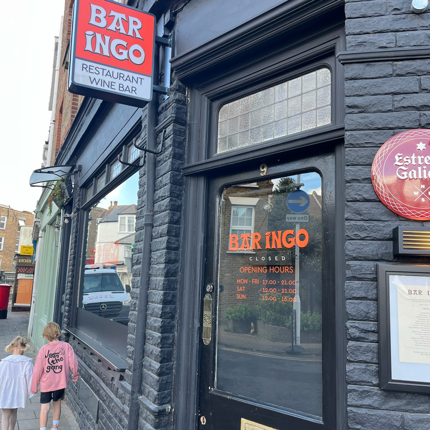
There are so many good food options in Broadstairs. For kid-friendly meals, we love the pizzas at Posillipo on Albion Street and Neptune's Hall on Harbour Street (two for one pizzas on Wednesdays, also does a great Sunday roast) especially if you snag a table in the courtyard garden. Loaded smash burgers are on the menu at Please Sir! on the High Street, while The Albion Hotel on Albion Street is a reliable spot for modern pub grub and has a large outdoor terrace overlooking Viking Bay. If you've got adventurous young eaters, or are after a kid-free treat, and want delicious modern food in a great atmosphere head to Bar Ingo on York Street, a cosy dining room with a sharing plates concept. Kebbells on Victoria Parade is probably more family-friendly but don't expect kiddie menu classics, it has the benefit of a brunch offering too. We love The Jetty on Pier Head (known locally as 'the Jetty') for unrivalled views of the waves crashing on the shore, and the broad menu and seasonal plates which are perfect for pleasing a group. Fifteen Square Metres on Oscar Road is a special spot for a child-free meal with food that gets raved about.
Save room for seaside classics
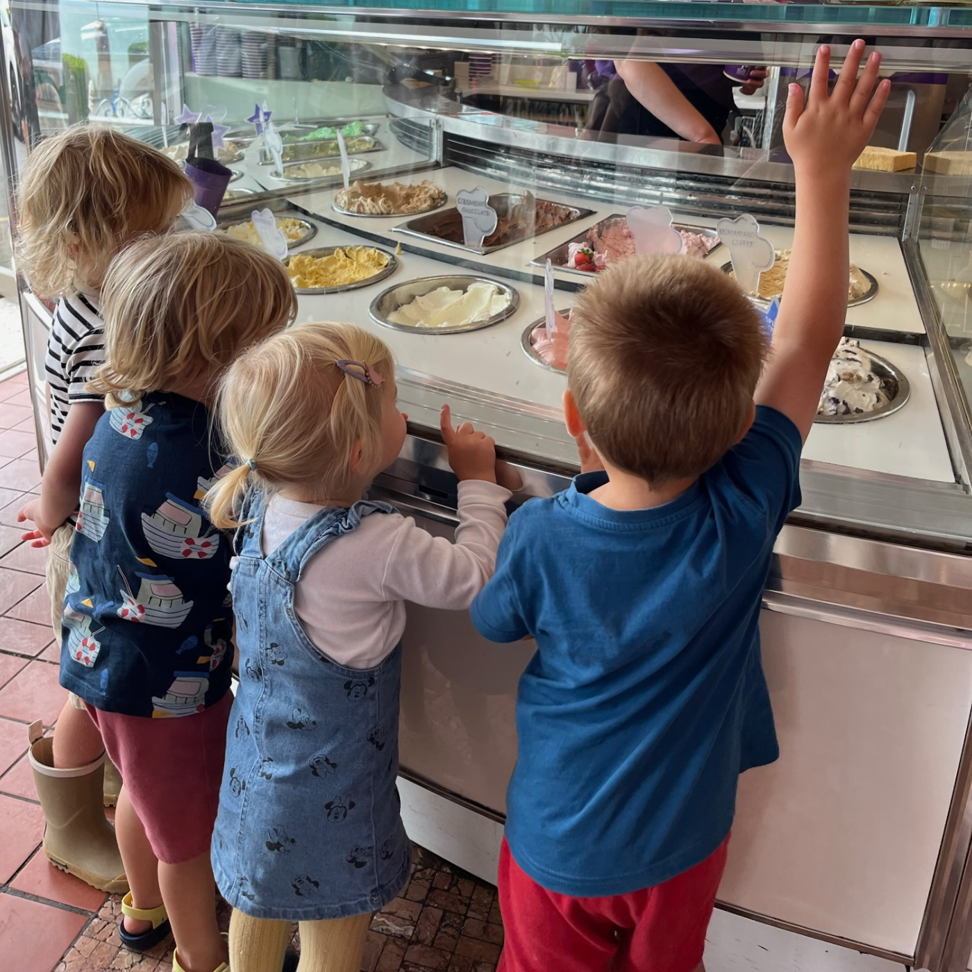
If you consider a seaside trip incomplete without fish and chips, then you'll be happy to learn there's plenty of traditional chippies to choose from: The Mermaid on Albion Street, the Seafarer on Albion Street, Star of the Sea on the High Street and the beach-adjacent Harbour Street Fish & Chips can all be relied upon for a classic fish supper. Perhaps one of the most famous spots in Broadstairs is Morelli's on Victoria Parade; the 1950s ice cream parlour is an institution among locals and visitors alike. Come for the old school aesthetic, stay for the sundaes. If it's too busy to nab a table, grab a scoop or two to go from the take away counter at the front and enjoy the view from the esplanade just a few feet away. Broadstairs actually boasts two old-school gelato spots, with Chiappini's on the Parade providing traditional Italian pastries and coffee alongside the iced delights. Snag one of the tables out front and you can enjoy your scoop with some of the best sea views around. A word of warning to all al fresco diners. The seagulls in Broadstairs are notorious for doing what seagulls do best: dive-bombing and stealing food with a fondness for fish, chips and ice-creams in particular! So keep your wits about you if you're tucking in on the beach or a seaside bench. A pop-up tent will keep little ones protected from seagulls and too much sun!
Free things to do with kids in Broadstairs
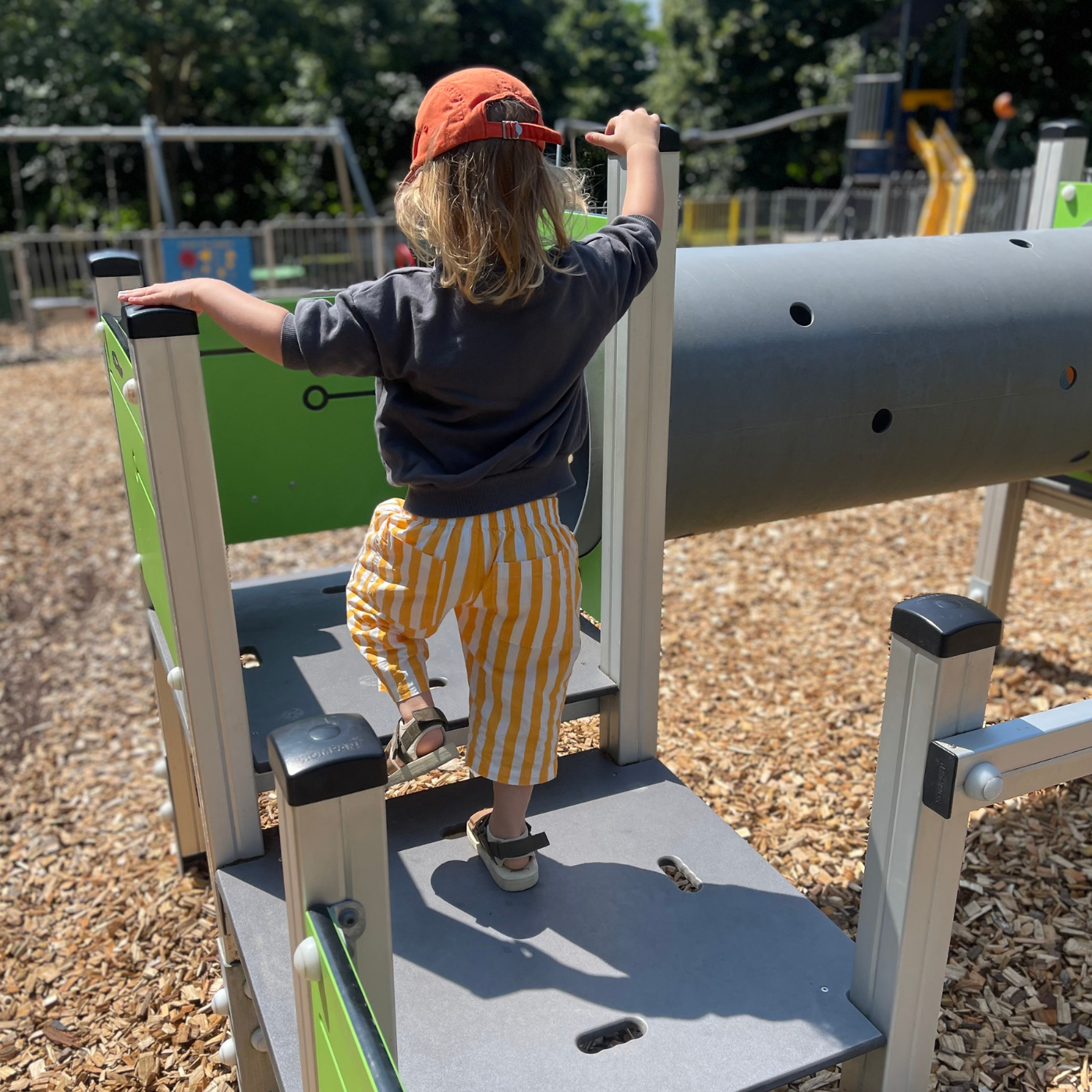
School holidays and summer breaks can feel like you spend £50 just to leave the house, but there's lots of free fun to be had in Broadstairs. There are two playgrounds in Broadstairs, both have a range of child-friendly equipment and apparatus. Located off the High Street, Pierremont Park is a great central stop for burning off some energy with equipment for both toddlers and older children, plus plenty of grassy open space if you fancy a picnic or a kick about. Head a little further up the High Street near the train stationand you'll find the Memorial Recreation Ground , with swings, slides, a zip-wire and more to keep children entertained. There's also a skate ramp , tennis and pickle ball courts that will appeal to older kids and teenagers. (If you need a caffeine hit before you can face the playground, or want to grab some picky bits for a picnic? Check out our fave coffee shops and independent food stores here ) We have a free craft corner and book nook in our sunshine store by the sea , and host a range of children's events including craft workshops, author readings and beach cleans throughout the year. All are welcome at Broadstairs Library where as well as a great children's library, there are plenty of activities for children including Rhyme Time, Lego club, craft events and board game sessions, plus if you're visiting from elsewhere in Kent you are able to borrow books with your library card.
See the beach differently
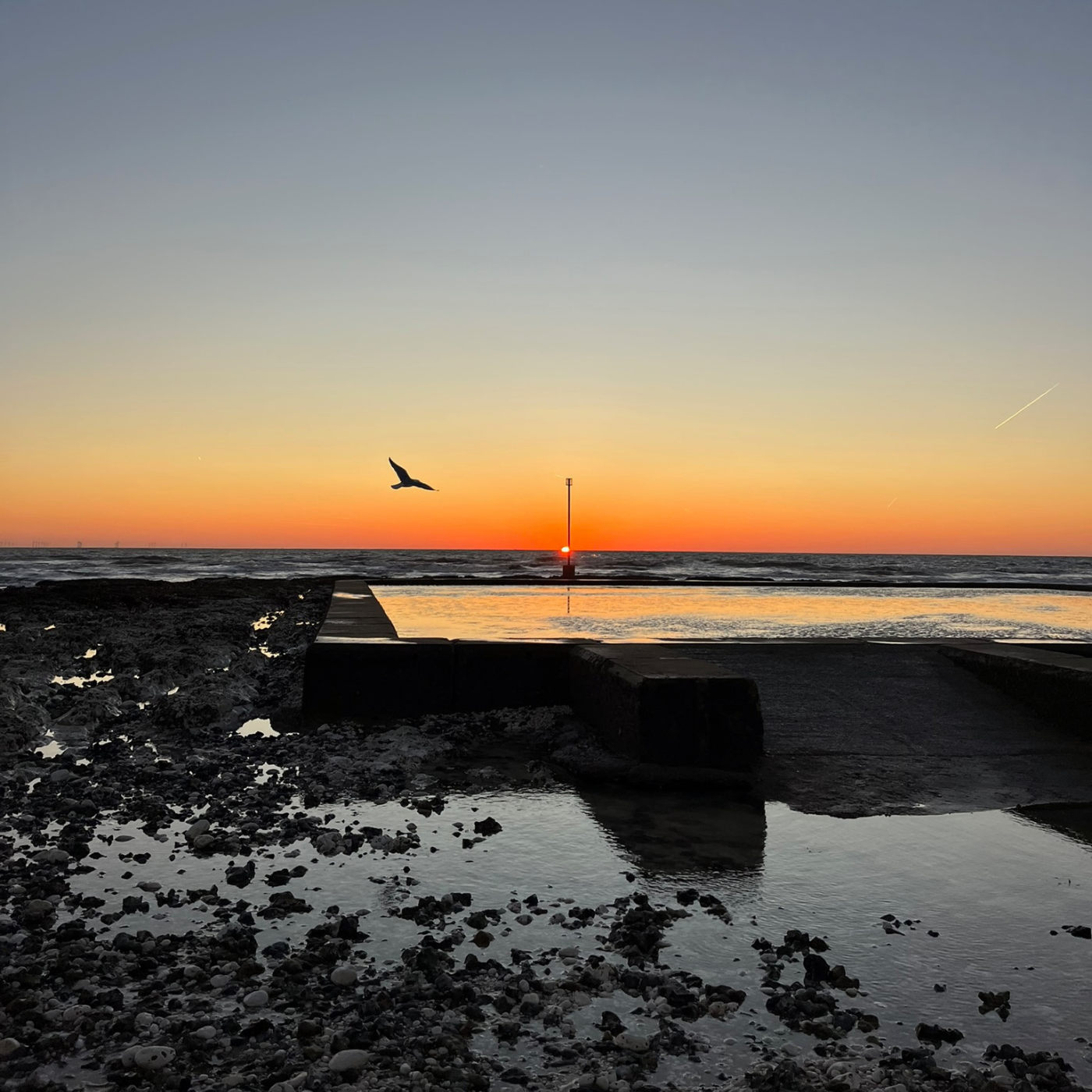
Low tide is a brilliant opportunity to explore the rock pools of our stunning coastline, check the tide times here to plan your expedition, and don't forget to grab a 'Rock Pool Life to Spot' mini book to help identify the little creatures and seashore life. Whether you're a family of early risers or need to set an alarm specially, the sunrise over Viking Bay is worth the early start. Get a simple breakfast ready the night before, grab a coffee and bring a blanket to enjoy a beach picnic that you'll remember forever. In the summer there's lots to see and do at The Bandstand , particularly during the big event that is Broadstairs Folk Week ( 8 - 14 August 2026) with live music to enjoy most lunchtimes. Hungry for more? Click here for Part One of our guide to the best of Broadstairs including our favourite coffee spots. PS: If you're anything like us, you probably had no idea quite how much of parenting would be asking your kids if they need the loo! You can find Broadstairs public toilets in the Crofts Place Car Park off the High Street, on Harbour Street near the ramp to Viking Bay, near the Bandstand on Victoria Parade as well as on Stone Bay and Viking Bay . Operated by Thanet District Council, find opening times here .
Kinder Collective is an award-winning, consciously-curated children's store by the sea in Broadstairs, Kent. Open seven days a week, we sell joyful preloved and new clothes, books, toys, games, homewares and gifts for newborn to nine-year-olds. To stay in the loop with our free events, product launches and more sign up to the Kinder Crew newsletter below.
Choosing a selection results in a full page refresh.
Opens in a new window.